

To match a photo print to your wall without a designer, pull the wall's dominant color first, then choose a print whose quieter background tones echo it. That's the whole trick, and it takes about three minutes on your phone. No color wheel, no swatches taped to the baseboard for a week, no second-guessing at checkout.
It helps that 2026 handed us two wildly different walls to work with. Pantone named Cloud Dancer, a soft, airy white, its Color of the Year, the first white it has ever chosen. Benjamin Moore went the opposite way with Silhouette, a deep espresso brown full of charcoal undertones. Most of us live somewhere between those two poles. The good news is that the same method works for both. Let's get into it!
Start with your wall's loudest color
Read the wall before you touch the camera roll. Stand back, half-close your eyes, and name the one color that fills the most space. That's your anchor, whether it's warm white, greige, sage, or a moody espresso.
Resist the urge to match the wall to a photo's brightest, prettiest spot. The wall sets the room's mood, so it gets to lead. A print of a sunlit beach can look loud and out of place on a deep, quiet wall, and perfect on a crisp white one. Same photo, different anchor.
Match the photo's background, not its subject
Look past the subject of a photo and read its quieter tones instead. The blurry kitchen behind your kid's birthday grin, the sand around the toddler, the wash of sky behind the dog mid-zoomie. Those background tones are what actually sit against your wall.
Read a beach photo as warm sand and pale sky, not simply blue. Read a forest hike as soft browns and gray light, not just green. Pick a print whose background quietly agrees with your anchor color, and the whole arrangement clicks into place. This is the step most decorating guides skip, and it does the real work.
Test the pairing on your phone before you print
Hold the photo up against the wall on your phone screen before you order a thing. Pull up the image, walk to the wall, and hold the screen at arm's length where the print will hang. Your eyes will tell you in two seconds whether the tones sit together or fight.
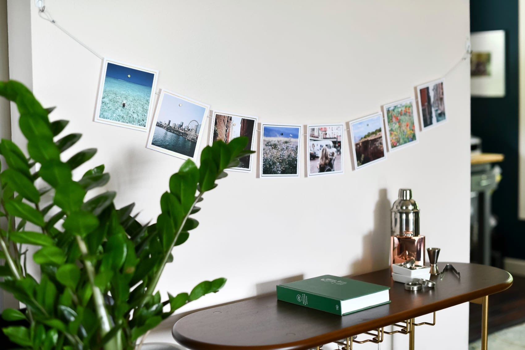
Snap a quick picture of your phone against the wall, too. Seeing it as a flat photo, the way a guest's eye takes in the room, catches clashes your brain politely ignores in person. When it looks calm and intentional on screen, order it. A Square Print or a small set of wall art is a low-stakes way to test a pairing you're not yet sure about.
Pair prints to 2026's two headline wall colors
Against a soft white like Cloud Dancer, almost anything breathes, so reach for prints with a little warmth so they don't disappear. Think golden-hour skin tones, a bowl of summer peaches, a beach towel in faded coral. A grid of Square Prints keeps that airy white feeling light instead of stark.
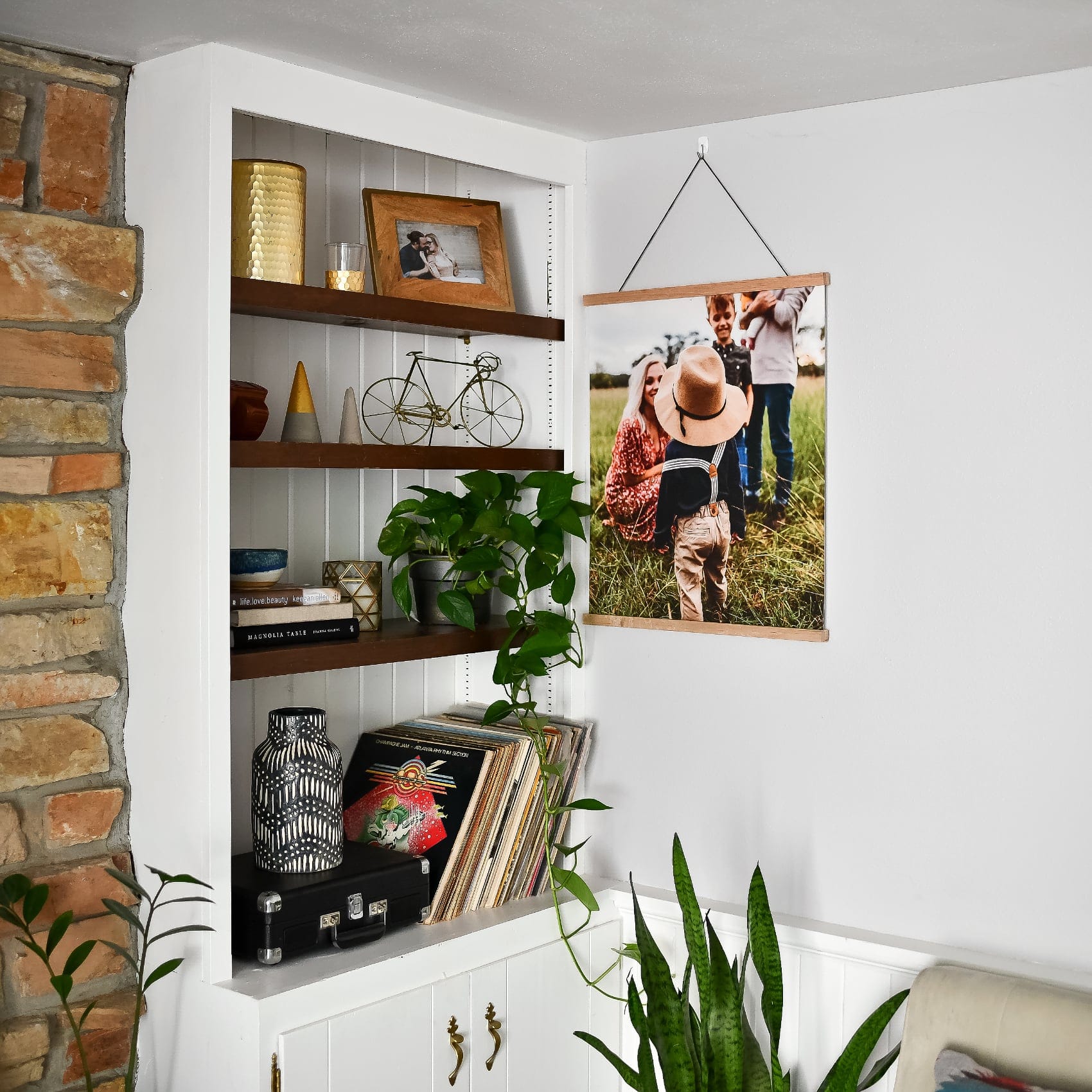
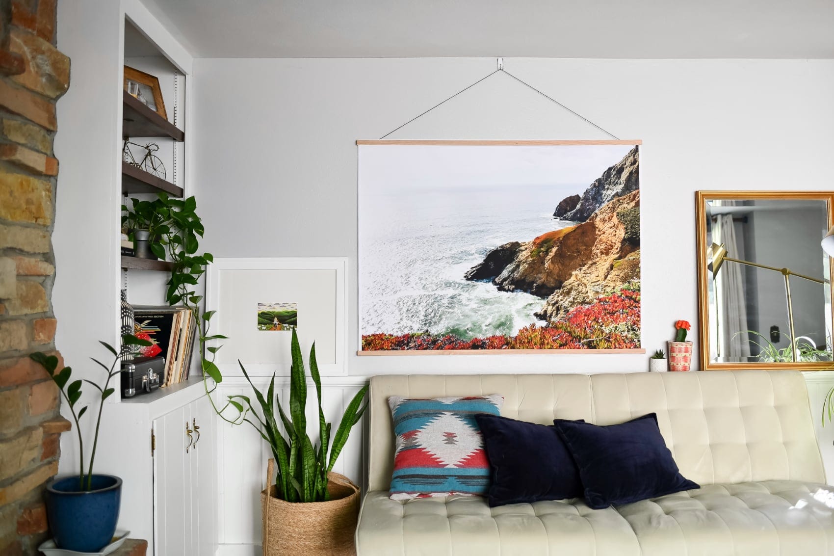
Against a deep espresso like Silhouette, go for contrast and glow. Bright, high-key photos pop beautifully off a dark wall, and a single large Engineer Print of one sun-drenched moment reads like a window cut into the shadow. Warm whites, creams, and skin tones in the photo will pick up the brown's cozy undertones and feel like they belong.
A few pairings to steal
Sage green wall? Reach for prints with warm wood, terracotta, or skin tones to balance the cool. Greige or warm gray? Almost anything works, so lean into your favorite memories and let the wall stay neutral. Soft blush wall? Keep prints calm with creams and greens so the room doesn't tip sugary.
When you have more than a wall's worth of favorites, a Photo Book holds the overflow without another nail in the plaster. Trust your anchor, read the backgrounds, test on your phone, and the rest takes care of itself.
Feeling inspired?! Shop wall art and find the print your wall has been waiting for. 🙂


