
Four decisions actually shape how a printed photo looks. They are aspect ratio, file resolution, color profile, and paper finish. Get those four right, and the rest of the jargon (PPI charts, color space acronyms, edge-to-edge versus border) stops being intimidating. The reason most camera-roll photos look slightly off on paper isn't quality. It's a small mismatch in one of those four areas.
We get a lot of questions that sound technical but really come down to those four moves. Picture a sunlit kitchen shot from last weekend, ready to land on a wall. The decoder below walks you from camera roll to finished print without the spec-sheet language.
Aspect ratio is the first thing that crops your print
Your iPhone shoots in 4:3 by default, which means a square print or a 5x7 print will lose something at the edges. As Digital Camera World puts it, "the iPhone's sensor has a 'native' aspect ratio of 4:3 – that's 4 units by 3 units, so it's rectangular rather than square." When you switch to 1:1 or 16:9 in the camera app, "the iPhone simply crops off some of the top or the bottom or the sides to get the new shape."
That matters at print time. A 4:3 photo doesn't fit a Square Print or a 5x7 Classic Print without losing some of the frame. The fix isn't a different camera. It's composing with a little extra breathing room around the subject, so the crop trims sky and counter rather than the top of someone's head.
The cleanest workflow is to shoot 4:3 and crop later in the Photos app. You keep all the pixels and decide the shape after the moment passes. Most prints look best when the subject sits roughly a third in from one edge, with quiet space around it.
How much resolution your print actually needs
The short answer is that 150 PPI is the floor, 300 PPI is the ceiling, and most home photo prints sit comfortably in between. Parabo's product pages spell this out. Square Prints and Classic Prints want "150+ PPI for the best results," while larger formats like Engineer Prints call for files that "are 5-10 MB in size and have a resolution of 300 PPI." Fine Art Prints sit in the same large-format territory.
Why two numbers? It comes down to viewing distance. Chilli Printing says directly that "150 DPI is the minimum resolution that is recommended for printing since anything below that can make your images look more distorted," and that "the further away the viewer, the lower the necessary resolution." For a 36x48 Engineer Print viewed from across the room, your eye smooths over pixel detail you'd notice in a 4x4 print held six inches away.
The same Chilli Printing piece puts the 300 PPI standard plainly. "The industry standard for high-quality printing is a resolution of 300 DPI." That's the goal for any small or mid-size print someone's going to pick up.
One practical rule we use ourselves. If your file is under 2 MB and you're ordering anything bigger than a 5x7, you'll usually see softness. Bigger files give the printer more to work with.
Why your phone photo looks different on paper
The reason a print sometimes looks slightly muted compared to your phone screen has a name, and it's color profile. DB Labs explains that "iPhone 7 and later capture photos in the Display P3 wide color space," and that P3 is a "wide color, which can show about 25% more colors than the sRGB standard."
Print labs typically work in sRGB. When a P3 file lands on a workflow expecting sRGB, the conversion can shift saturated reds, greens, and oranges toward a slightly flatter version, especially in sunset skies and lush foliage. The same DB Labs piece is direct. "Professional photo labs expect sRGB files. If you upload P3 files to a lab that does not handle P3 natively, the conversion may produce slightly unexpected colors in prints."
There's a related trap. Tov Studio Photo flags it: "Without embedded profile, the viewing device assumes sRGB by default — meaning an Adobe RGB file sent without its profile will render with muted colors, because the device interprets the wider-gamut color numbers as if they were sRGB numbers." How you export matters as much as what you shot.
The easy fix for everyday phone photographers is to upload straight from the Photos app. Most modern print services handle the P3-to-sRGB conversion automatically. If you've been editing in a desktop app, double-check that the color profile is embedded on export. The colors land closer to what you saw on screen.
Paper finish, and why matte is almost always right
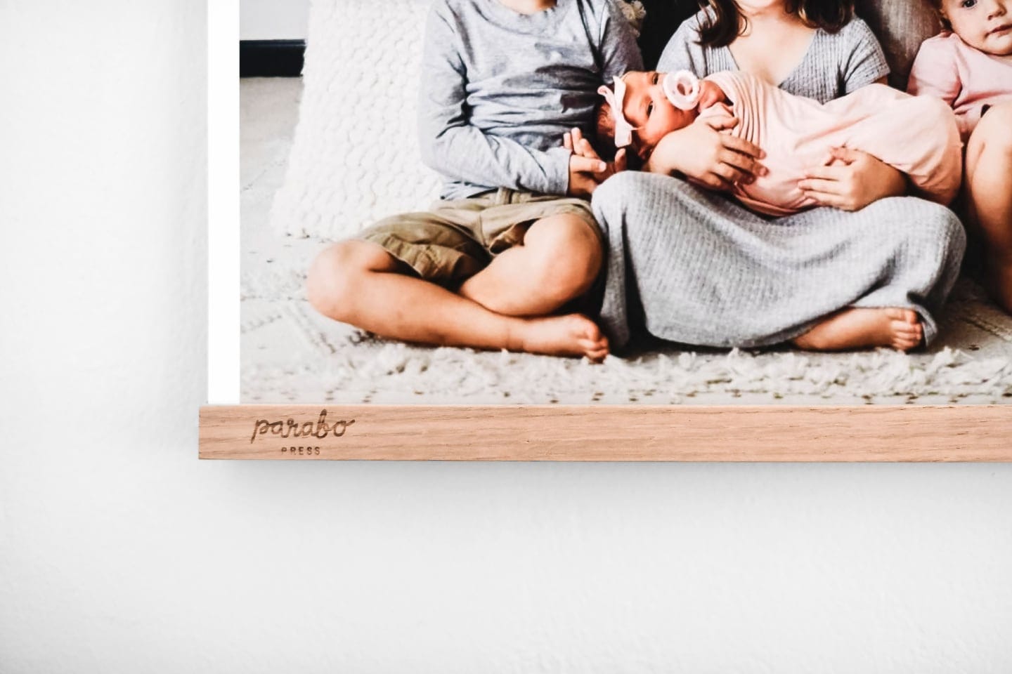
Matte is the safe answer for nearly every photo we send to print. Parabo's Square Prints, Classic Prints, Fine Art Prints, and Photo Books all sit on uncoated paper. The reason it works almost everywhere is that the surface reads as a photograph rather than a gift-shop reprint. It absorbs reflections under lamp light and looks calm on a wall.
The Square Print and Classic Print use "thick, matte paper that is certified by the Rainforest Alliance Program for FSC Standards." The Fine Art Print uses the same flat finish with "archival museum-quality inks" and runs from $30. The Photo Book uses "premium matte paper pages" across the softcover and hardcover lines.
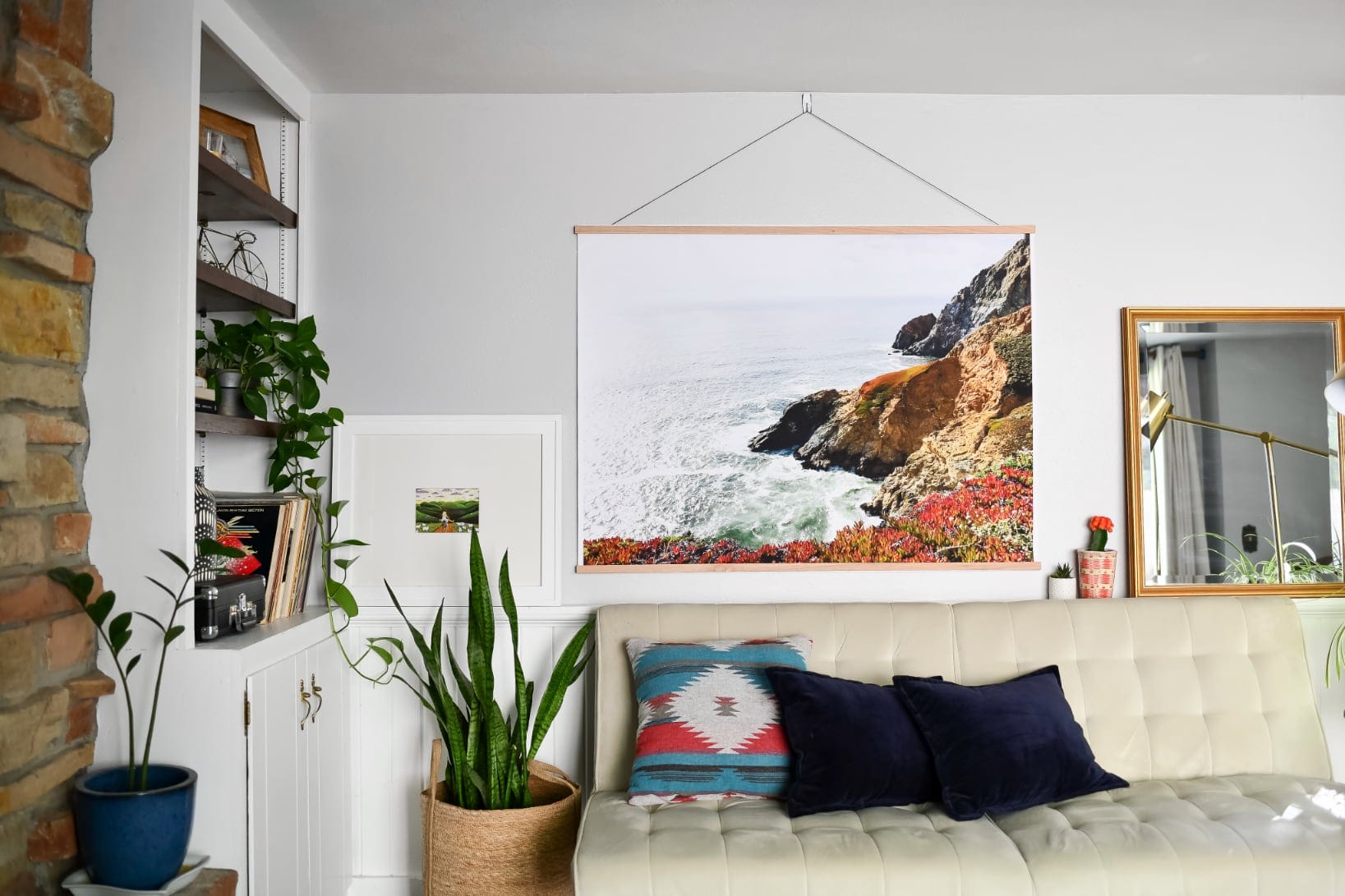
The one finish that does something different is the Engineer Print. It runs 36x48 inches on "extra-light 20 lb. paper" with a 1/2 inch white border, starting at $40. It's architectural paper at gallery scale, and that's the point. A black-and-white kid portrait at 36x48 on engineer stock feels like a poster pinned in a loft. The same shot framed at 8x10 feels like a keepsake on a nightstand. Same photo, two completely different rooms, both choices defensible.
A note on borders. Parabo Square Prints ship with "crisp white border or edge-to-edge printing." That's a styling decision, not a quality one. Borders read museum-clean, while edge-to-edge reads photographic and immediate. Try both. Most people land on borders for gallery walls and edge-to-edge for fridge stacks.
The simple version
If you remember nothing else, remember this. Shoot 4:3 and crop later. Aim for 150 PPI or higher, 300 if the print is going on a wall. Upload straight from your phone so the lab handles the color conversion. Pick matte unless you specifically want the Engineer Print's poster feel. Those four moves cover most of what makes a print look great.
Parabo prints are carefully crafted in Utah, Oregon, and our home state of Wisconsin. We've spent more than a decade answering some version of these questions every week, and the technical vocabulary feels heavy until you realize most of it lives outside those four decisions. Now you know which four.
Feeling ready? Shop photo prints.


