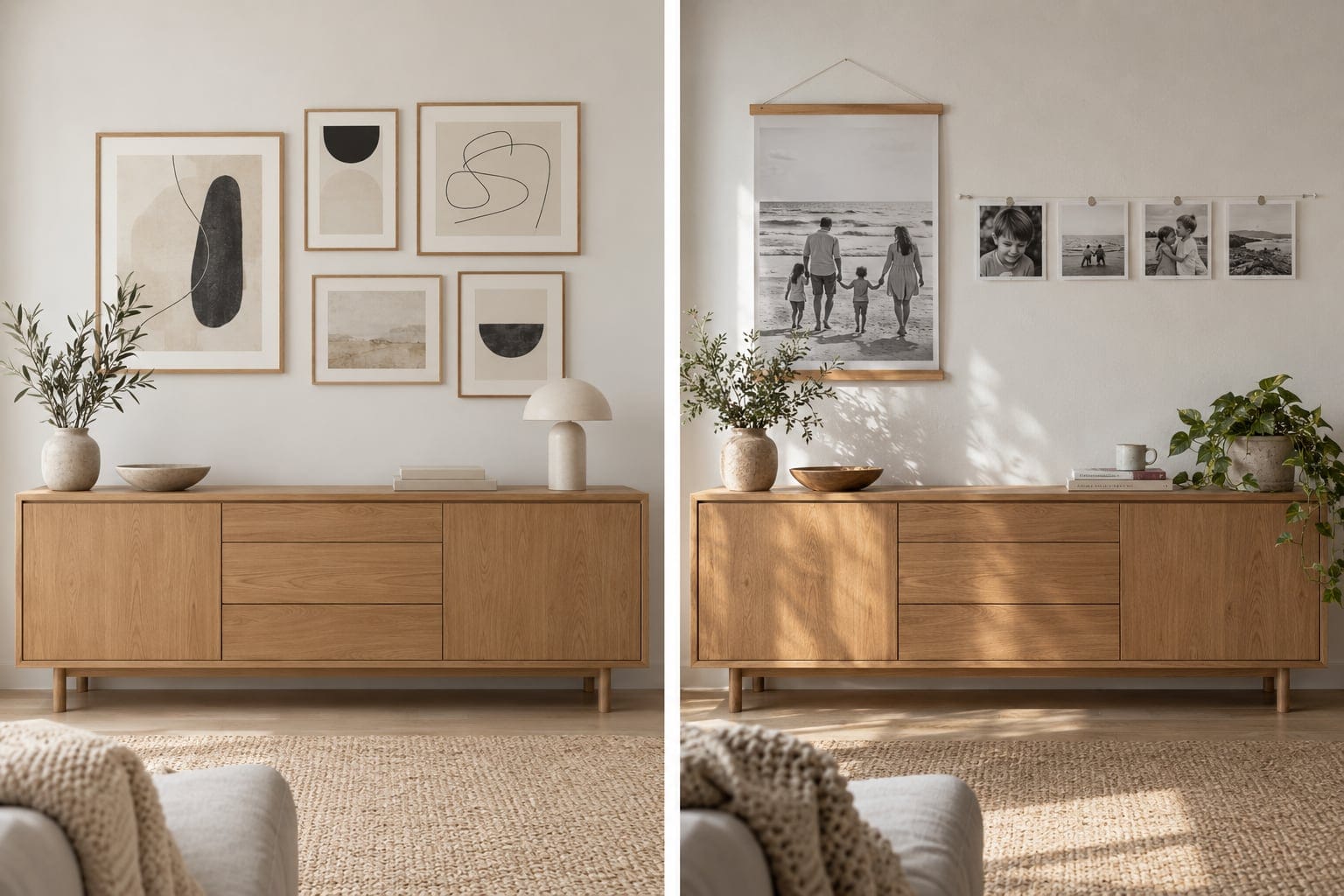
A handful of photos from your camera roll belong on your wall. The photos you print are a design decision, one that shapes a room as surely as your paint color or your sofa. Consider picking with your eye as well as your heart, so prints feel integrated.
One approach is to shift from printing phone snapshots to printing for your space. Matching a photo's colors and mood to a room can help it feel like chosen art.
1. Audit the mood of your space before you print anything
Walk into your room and name its feeling in one word. Warm and rustic? Beachy and coastal? Rich and moody, like a peacock-blue speakeasy? Minimal and airy? That single word is your filter for everything that follows.
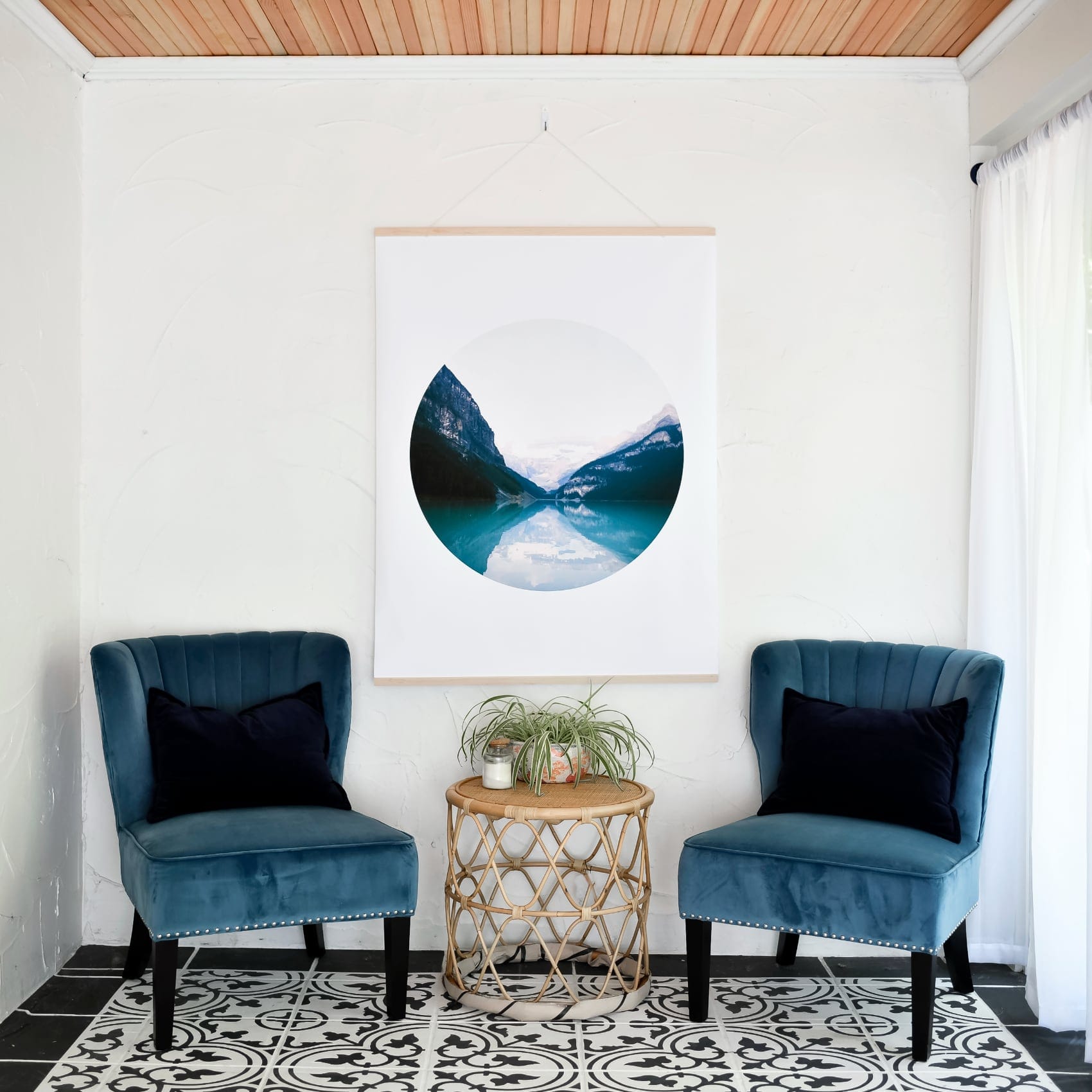
Once you've named the mood, the photos that fit it become obvious. A coastal room wants faded corals and soft blues. A moody room wants deep shadow and one glowing highlight.
2. Treat color temperature, subject, and composition as design tools
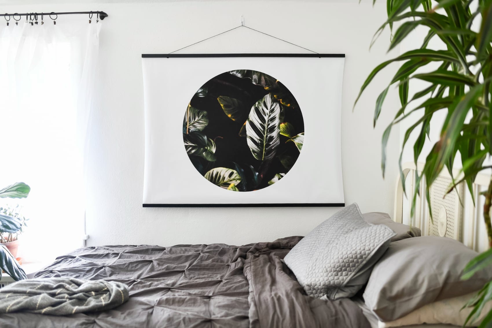
The colors, subjects, and framing you select shape a room's feel as much as furniture does. Color temperature does the heavy lifting. Warm, golden-hour tones settle into rustic and neutral rooms, while bright, high-key photos pop off a dark wall like a window cut into the shadow.
Subject and composition matter too. A tight close-up of skin tones reads warm and intimate; a wide, minimal landscape reads calm and spacious. Match those qualities to the room you're dressing, and cohesion happens on its own.
3. Matte and square formats blend into a curated look
Matte photo printing gives prints a soft, glare-free finish that reads as art rather than snapshot. These qualities, the matte surface and tidy square shape, help Square Prints settle into a gallery wall instead of competing with it.
The square format works well in a grid, creating a cohesive, gallery-like display. If you want a range of grid-friendly formats, Print Sets, Tiny Square Prints, and Colorful Square Prints with Colored Borders are all built for building a look that hangs together.
4. The five-photo exercise: match your dominant room color
Try this right now. Pick your favorite room and name its dominant color, the paint, the sofa, the rug, whatever carries the most visual weight. Then open your camera roll and hunt for photos that echo it.
Start by naming the room's dominant color out loud. Scroll your camera roll with that color in mind and pick five photos that share that color or its warm/cool temperature. Line them up side by side and cut the two weakest, then print the remaining three as your first test.
Ask four questions about each candidate, Would you frame it? Would you miss it if it were gone? Is a favorite person in it? Does it tell a story? A yes to two or more means it earns a spot.
5. Start with a low-stakes test print
A small test print is a smart first move. Starting with a set of square photos or classic 5×7s keeps the commitment light while you figure out what you love.
You get to see real color on real paper before you scale up to wall art. If the mood matches, print more. If it's off, you've spent very little to learn it.
Print a small set, see what matches your space, and go from there.